← Back to all entrances
Case study · 2025–26 Argus Farm Stop

Making a farm stop feel easier to choose

Students cared about local food, but convenience, not price, quality, or even sustainability, decided where they shopped. I followed that finding from interviews and usability tests to a journey map and recommendations for Argus.

Role
UX researcher: interviews, usability tests, usability audit, competitive analysis, journey map, recommendations
When
Class project · August to December 2025
Team
3 UX researchers on the class project
Tools
Figma, FigJam, Canva, Miro, Zoom, WAVE, ChatGPT, Claude

the problem

Argus had a strong local-food mission and 200+ Michigan farms and food producers on its shelves. But University of Michigan students weren't shopping there.

what I did

We interviewed 9 students, tested the site with 6 more over Zoom, and compared five competitors. I led the website usability audit and mapped a student's journey from our findings.

where it stands

Our findings and recommendations went to Argus's marketing manager.

my role

I worked with two teammates. We split the sessions between us: I ran 3 of the 9 interviews and 2 of the 6 usability tests. We conducted the competitive analysis together, and I independently led the website usability audit.

Research
Student interviews, synthesis contributions, journey map
Evaluation
Website usability audit, competitive analysis
Strategy
Stakeholder recommendations

“It's hard to match your schedule.”

A student we interviewed
Mile 1 · Sit with the problem

Students weren't shopping there

Argus Farm Stop is a year-round farmers market and café that's been serving Ann Arbor since 2014. Farmers drop off their food, set their own prices and keep 70% of every sale, so Argus can sell local food every day while the farmers stay on the farm. But despite its strong mission, University of Michigan students largely weren't shopping there.

This project started as a class assignment, but I wanted it to mean something beyond the grade. Before we began, I reached out to Argus Farm Stop directly to ask whether this was a problem they were actually facing and whether research like ours could be genuinely useful to them. That conversation shaped everything. It kept our work grounded in real organizational needs rather than hypothetical ones, and it gave me a stakeholder relationship to stay accountable to throughout the process.

Were students avoiding Argus because of affordability, convenience, visibility, or something else? We set out to answer:

the constraint

Argus takes orders on separate stores: the Argus Online Market on Localine, Argus Shop, and Square for gift cards. Only argusfarmstop.com was ours to change, so anything that happens inside those stores became a recommendation instead of a design.
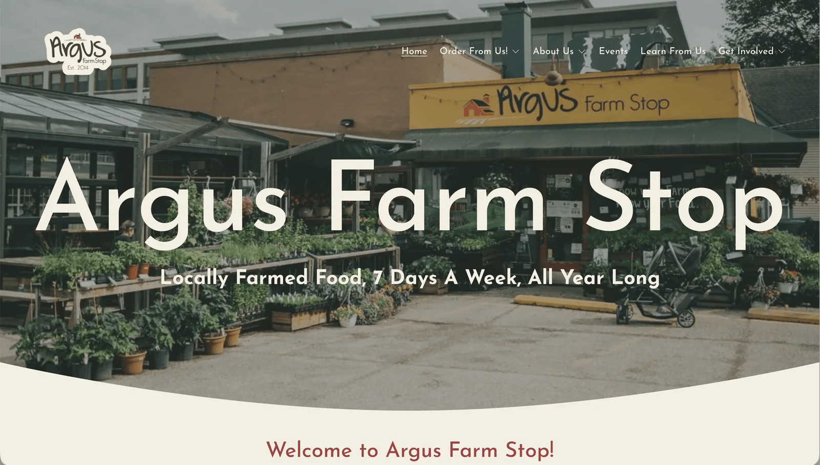
Argus Farm Stop's existing homepage: a full-width photo of the storefront with plants for sale out front, the words 'Argus Farm Stop' and 'Locally Farmed Food, 7 Days A Week, All Year Long' in large white type, and a menu with Order From Us, About Us, Events, Learn From Us and Get Involved.
Before: Argus's existing homepage. It didn't clearly communicate the store's value proposition to first-time visitors.
Mile 2 · Listen to real people

What we heard from students

We interviewed students, watched others use the website, and compared Argus with five competitors.
  • Student interviews9 University of Michigan students, split across our team of three
  • Usability tests6 students over Zoom, thinking aloud through real tasks on Argus's site
  • Website usability auditA WAVE accessibility check and heuristic review I led independently, benchmarked against Agricole Farm Stop in Chelsea, MI
  • Competitive analysisFive competitors compared on branding, e-commerce features and storytelling: Fresh Thyme, People's Food Co-op and Centre Markets (direct), Instacart (indirect) and Etsy (analogous)
  • Affinity synthesisInterview and session notes grouped into themes in Miro
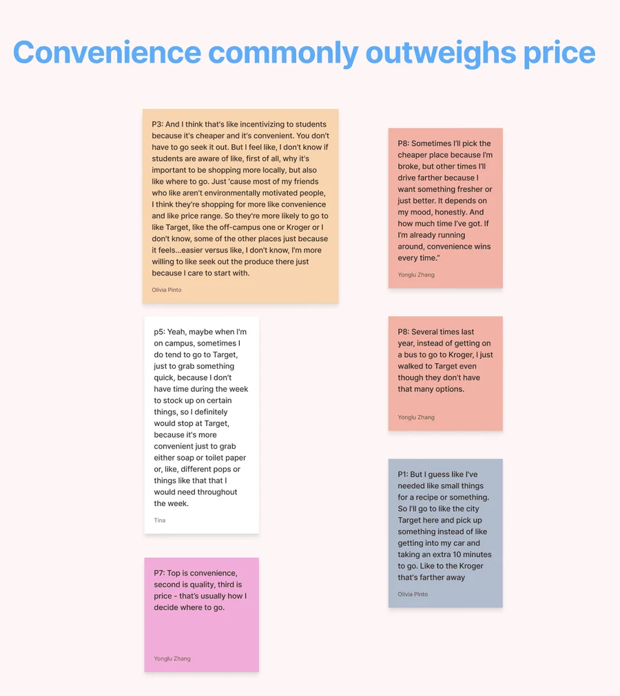
A Miro cluster titled 'Convenience commonly outweighs price,' with interview notes from students: one stops at Target on campus because she has no time during the week to stock up, another says 'top is convenience, second is quality, third is price,' and another walked to Target instead of taking a bus to Kroger.
One cluster from our Miro board, in students' own words

Patterns that kept appearing

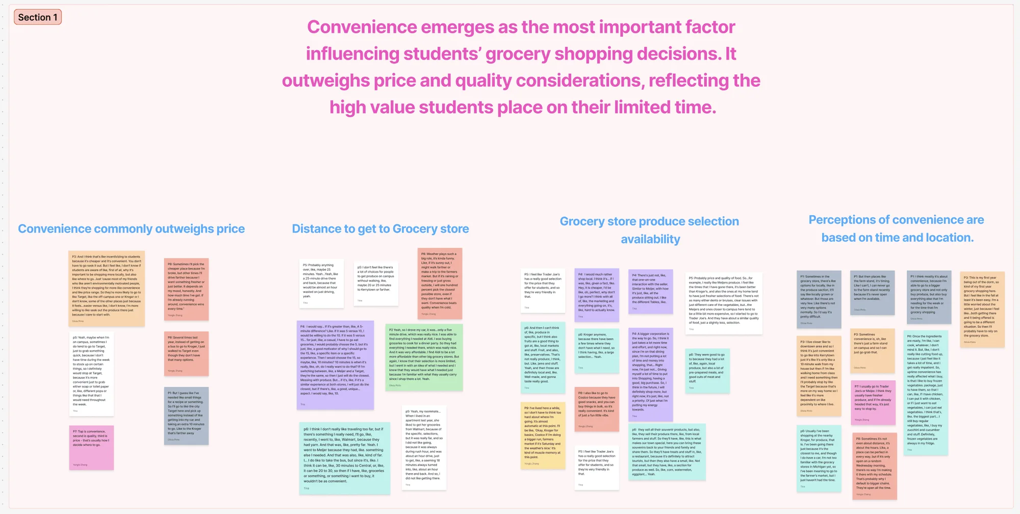
Miro board section 1, headed 'Convenience emerges as the most important factor influencing students' grocery shopping decisions. It outweighs price and quality considerations, reflecting the high value students place on their limited time,' with sticky-note clusters on convenience versus price, distance to the store, produce selection, and perceptions of convenience based on time and location.
Convenience outweighed price and quality
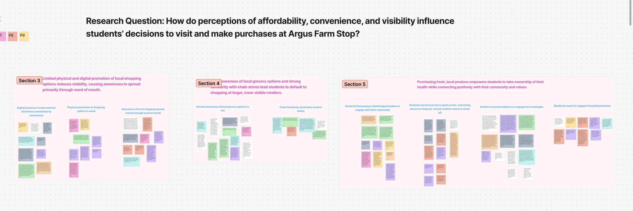
Miro board under the research question, with sections on limited physical and digital promotion of local shopping, low awareness and strong familiarity with chain stores, and how buying fresh local produce connects students with their community and values.
Visibility, awareness and values, grouped under our research question
Watching

Students wanted to support Argus. The website got in the way.

To see whether the website itself was part of the barrier, we ran moderated usability tests over Zoom with six University of Michigan students who grocery shop and had ordered groceries online before. Most were first-time visitors to the Argus site. They thought aloud while completing goal-based tasks, and we logged task success, time, errors, hesitations, and comments for each session. Argus provided $10 gift cards as participant incentives.

Participants
6 University of Michigan students
Method
Moderated think-aloud over Zoom
Tasks
Order for pickup, subscribe to the Weekly Produce Box and Monthly Local Cuts Club, find a vendor's website, get food today, send a gift card, find newsletter and SNAP information
Measures
Task success, time, errors, hesitations, comments

where tasks broke down

0 of 6worked out how to get ready-to-eat food the same day
~1 of 6reached a farm's website by looking up who grew a product
4 of 6set up the weekly produce box, one of them with help

three issues came up again and again

  1. Text that looked like links but wasn'tFarm names on product pages were red or bold, so participants tried to click them to find the vendor. One said, “I'm looking for a place to click.”
  2. Getting lost between two sitesShopping happens on Localine, a separate platform with a different look. Participants weren't sure which site they were on or how to get back to the Argus homepage.
  3. Subscriptions hidden from the shopThe produce box and meat subscription weren't in the main catalog. They lived on separate pages with different layouts, so most participants couldn't find them while browsing.

Our clearest takeaway: even students who wanted to support Argus said the experience felt fragmented. One said they'd rather just shop in person.

The audit I led

I checked the existing site with the WAVE accessibility tool and a heuristic review, then benchmarked it against Agricole Farm Stop in Chelsea, MI. Agricole explains what it is in one sentence above the fold, with a five-item menu. Argus took scrolling to explain itself, behind six menu items with dropdowns, and its three main options were illustrated cards that didn't look clickable.

8errors, including missing alt text and a missing form label
34contrast errors, mostly text over the hero photo
37alerts for other accessibility concerns

what competitors did better

Say what you are, up front

The strongest sites described the business in the hero and gave a clear, immediate call to action.

Make reordering easy

Buy It Again, Favorites and Save for Later were standard elsewhere and missing from Argus.

Promote what's in season

Banners, deals and seasonal promotions gave shoppers a reason to look again. Argus had little of this.

Put people in the pictures

Grids of farmers, real photos and short stories humanized the people behind the food.

Mile 3 · Find the insight

Convenience outweighed everything else

Convenience emerged as the single most important factor in students' grocery decisions, outweighing both price and quality. Students shop where they can get in and out quickly, on foot or on their way to class. Even when they were sympathetic to shopping local, most assumed Argus would be more expensive than chain stores, a perception that often wasn't tested. And while students cared about sustainability and community, those values didn't reliably translate into behavior once time, money, and access got in the way.
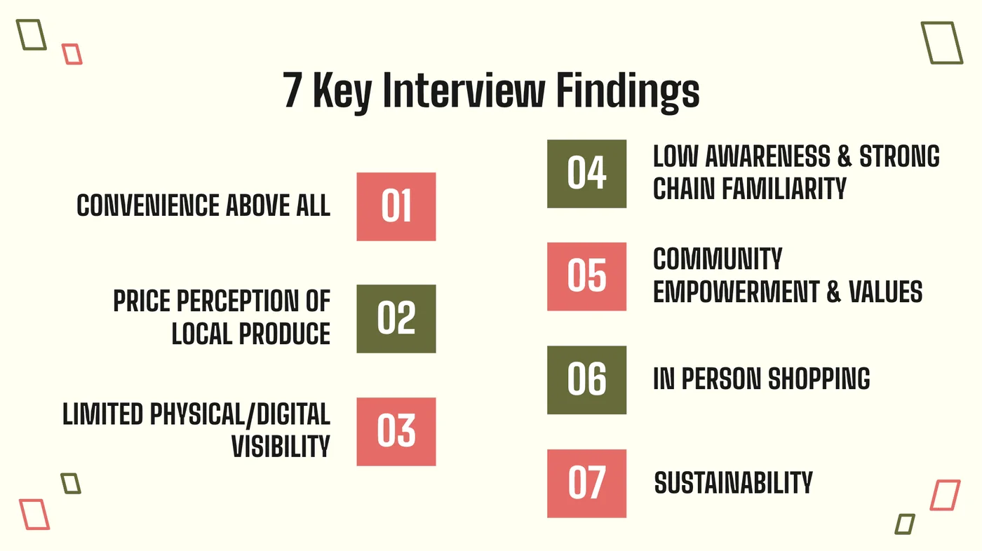
  1. ConvenienceStudents prioritized getting groceries quickly and easily.
  2. Perceived costMany assumed Argus would be more expensive without actually checking.
  3. Values ≠ behaviorStudents cared about sustainability and community, but those values didn't overcome time and access barriers.
  4. Lack of familiarityThe Farm Stop model itself required explanation.
A slide titled '7 Key Interview Findings': convenience above all, price perception of local produce, limited physical and digital visibility, low awareness and strong chain familiarity, community empowerment and values, in-person shopping, and sustainability.
The seven interview findings behind those four patterns

Meet the person behind the pattern

Sophie doesn't need to be convinced that local food matters. If shopping local requires extra planning, she won't do it consistently. Every participant was a student, so I kept to one persona rather than inventing others the research couldn't support.
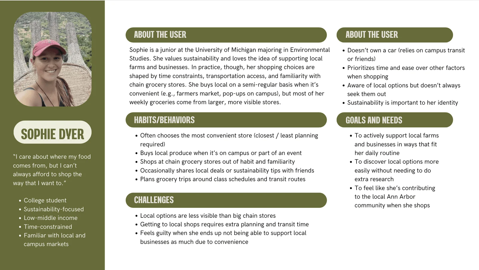
Persona card for Sophie Dyer, a University of Michigan junior in Environmental Studies who says 'I care about where my food comes from, but I can't always afford to shop the way that I want to.' She doesn't own a car, prioritizes time and ease, often chooses the most convenient store, and wants to discover local options without extra research.
Sophie, our student persona

Following Sophie through a week

I used ChatGPT to synthesize our research into a journey map. It follows Sophie from her usual grocery run to whether she comes back the next week, and every pain point is tagged with the finding behind it. Her two lowest points both happen on the website: checking whether Argus is worth the trip, and picking how to shop. That's where design could help her most.
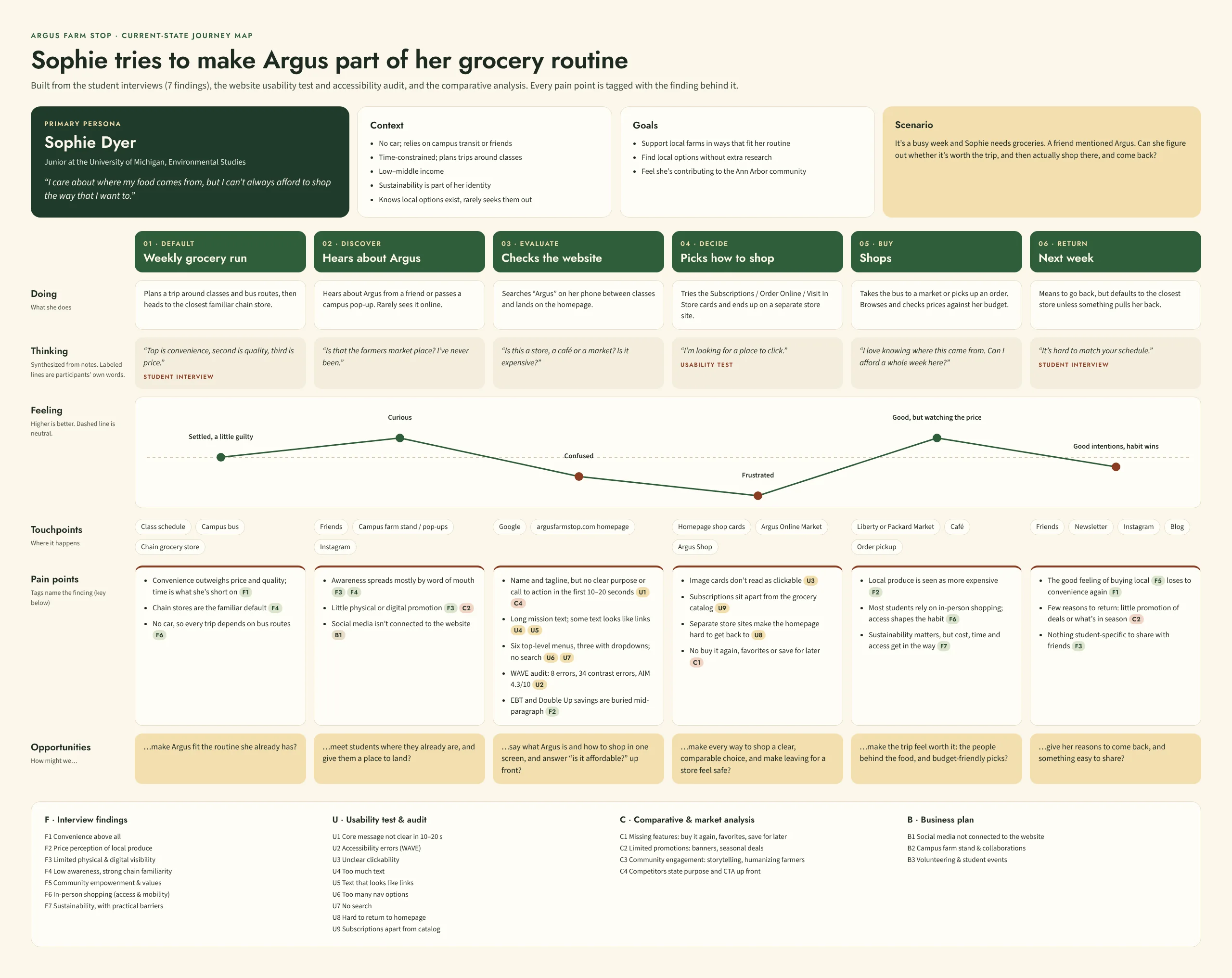
Journey map for Sophie across six stages: weekly grocery run, hears about Argus, checks the website, picks how to shop, shops, and next week. Rows show what she does, what she's thinking, how she feels, touchpoints, pain points tagged with research findings, and how-might-we opportunities. Her feelings start neutral, rise to curious when she hears about Argus, drop to confused on the website and frustrated when picking how to shop, rise to good but price-conscious while shopping, and settle below neutral as habit wins the next week.
Sophie's journey, built from all three studies. Click to open it full size.

what we found

Convenience, not price or values, decided where students shopped.

how might we

How might we make Argus feel easier to choose?

Mile 4 · Admit what I got wrong

What I'd do differently

The $10 gift cards from Argus made recruiting easy: people said yes to giving us their time, and we never struggled to fill sessions. After LendMate, where we had no incentive and recruiting was hard, that difference stuck with me. Next time I'd also recruit students who already shop at Argus alongside ones who'd never heard of it, so we could build more than one student persona.

Mile 5 · Make it work for them

What I recommended

I delivered a formal research presentation to Argus Farm Stop's marketing manager, translating our UX findings into a prioritized set of actionable recommendations organized by impact and implementation effort.
  1. Website & digital presenceUnify the Argus site and the shopping experience so people never feel like they've left. Put subscriptions in the main catalog, link every farm name to its profile, and add Favorites and Buy It Again for quick reorders.
  2. Brand positioningLead with what makes Argus different: a market and café where you can meet the farmers who grow your food, with a clear tagline, photos of real producers and customers, and a simple explanation of the Farm Stop model.
  3. Customer acquisition strategyAwareness spreads mostly through word of mouth. Reach students with visible promotions and seasonal items, the café and ready-to-eat food they already look for, and proof that pickup and SNAP make Argus more accessible than they assume.
Title slide reading 'Argus Farm Stop Business Plan, by Tina Chao,' with the Argus Farm Stop logo on a green panel.
From the deck I presented to Argus

how we'd know it worked

If Argus acts on these recommendations, these are the numbers I'd watch:

  • Pickup orders from students: whether more students order ahead once shopping feels like one site
  • Produce box sign-ups: whether subscriptions grow once they sit in the main catalog
  • Repeat orders: how many first-time online shoppers order again within a month

Thank you to my teammates Olivia Pinto and Lulu Zhang, and to Alex, Argus Farm Stop's marketing manager.

AI use: I used ChatGPT to synthesize our research into a journey map, and Claude (Anthropic) to help write this case study.

Reflection

I was surprised how many students cared about shopping local. Caring wasn't the real problem; it was finding a time to fit it into their schedule.